Exercise 4.2: Artificial Light

Capture ‘the beauty of artificial light’ in a short sequence of shots (‘beauty’ is, of course, a subjective term). The correct white balance setting will be important; this can get tricky – but interesting – if there are mixed light sources of different colour temperatures in the same shot. You can shoot indoors or outside and the light can be ambient or handheld flash.

Add the sequence to your learning log. In your notes try to describe the difference in the quality of light from the daylight shots in Exercise 4.1.


Simplicity. In the case of the images in this exercise I see simplicity being the key quality in artificial light that is less evident in natural light. That is to say natural light is likely to be much more complex. This is I think to be expected as natural light contains elements from the full visible spectrum whereas artificial light has only a limited slice through the spectrum. This is not always the case of course since the artificial light can take on a myriad of different colours and heats ( neon, tungsten etc ) however in the case of the images below, I have used a single source of light in an otherwise dark background to bring simplicity and strength of detail to the images.


Pear tree in the rain


Untitled


Untitled


Thoughts on submission

This post accompanies the final submission of all five assignments for Expressing Your Vision and aims to summarise my thoughts, experiences, and learnings now that I have just completed the course.

On the whole, I have enjoyed the course and found the exercises, projects, and assignments both interesting and challenging. I remain confused as to the nature of and difference between a project and an exercise but that is a very small point. Looking back from assignment 5 to the first assignment ‘the square mile’, I can see a great degree of progress in my own work, more than I think I expected to see. I believe the images in the assignments become progressively stronger in a range of aspects. They are more well thought out and considered.

I have relaxed. Seems a simple statement but I think it is important in my progress as a photographer. I think this can best be seen in the number of images in contact sheets for the assignments, which I think become fewer as the assignments progress. This is because I am more relaxed and considered in the shots I am taking, I have a greater degree of a pre-imagined image in my mind’s eye before I shoot which I think results in better images for fewer shots taken. This is probably the aspect of my photography which I can see within myself.

I have switched from Aperture priority to Manual mode, I don’t think I will switch back. I have found that manual mode and the selection of exposure has become 2nd nature and allows me much more flexibility to set the mood I want from the shot. This has taken my photography past the goal of ‘correct’ exposure towards the exposure I want. I can create images in-camera which are much closer to the mood I am looking for. As a result, I find I now spend far less time and effort in post-production as my images are closer to what I am looking for.

Simple is strong. I think always knew this but now have greater degree of confidence to seek simplicity and use this to create stronger images. I think this is evident in assignments 4 and 5 where the ideas and concepts I aim to represent in the images are a little more complex and so require strength to convey.

I have gained some interest in the work of other photographers due to the examples given, research exercises etc throughout the course. There are some specific learning log entries which are devoted to some of these photographers. For now, I have tended to consider photographers from earlier in the history of the art form, this I think is typical of me and how I like to work, addressing things in some kind of order which makes sense to me.

This tendency of mine to apply some kind of order is another area I think I have gained some personal experience of and learning from.

Sequencing is its own language. I remain a novice in this area however during this course I have learned and to some extent wrestled with this area. I tend to sequence images following some internal logic, this is just how my mind works so I will always start there. The logical order could be geometric, or conceptual or narrative or something else. However, during the course I have learned that there is another way to look at this which may not be described simply in logic and relates more to the impact the sequence can have. The introduction and release of tension for instance. This is best seen in the work and then rework for assignment 2, where the initial sequence has a very clear logic however once re-sequenced after feedback from my tutor, the logic has gone but the sequence is more interesting, balanced and complementary ( in my opinion of course ).


Robin Gillanders

Looking at a series of photographs from Robin Gillanders I took note of the depth of field used and compare with the depth of field I have used in assignment 5.

For my assignment 5, I use a very shallow depth of field, most images are f1.4, contrast to images from Robin Gillanders example here – https://www.robingillanders.com/photo_11085363.html#photos_id=11056607

The depth of field is shallow but not as pronounced, more natural. Of course, the choice was mine to use such a shallow depth of field for my submission and I stand by that choice as I wanted to produce a profound feeling of reduced understanding and clarity in the viewer as a core component of the theme. There is something very natural about these images though. Worth investigating in the future as I feel my use of aperture is limited; shallow or deep, <= 2.2 or >= 7.1

Great light and depth of field here also – https://www.robingillanders.com/photo_11085363.html#photos_id=11085358

Robin Gillanders. 2019. Robin Gillanders. [ONLINE] Available at: https://www.robingillanders.com/. [Accessed 3 September 2019].

Assignment 5 changes after tutor review 2

Following comments from my tutor I have reconsidered one of the images from assignment 5. The final image – moment

Untitled


This image is the only image in the series to have faces. Most all other images save – connected are still life images in nature and so this image introduces inconsistency and a change in nature of the series.

I understand this and have considered how to resolve, however, I have decided to keep with this image for my submission. This image for me is the most important in the series in that it resolves the entire series which prior to this expresses time as something we are at best confused by and in many ways slaves to. Here we transcend and conquer time. It is a human triumph and so the image must be of people.

What have I learned from this?

Consider the viewpoint and opinion of others but ultimately be true to your vision.

Assignment 5 changes after tutor review

For final submission to assessment I have considered comments from my tutor on assignment 5.

The assignment has a strong consistency message brought across by using very low depth of field on many of the images. I used a 50mm prime lens with max aperture f1.4. There are two images for which this is less apparent however which I have decided to revisit and consider for change

Image 1 Connected

Untitled

This image was taken with a wide aperture f2.2 however the composition is very flat and so the shallow depth of field is not apparent ( the background is actually grass about 3 feet away and is very out of focus ). I thought about retaking this image at an angle however I couldn’t visualize an acceptable way to bring across the message I wanted to. So I experimented with an alternative way to bring across the same message using a chain.

Untitled

I have decided in this case to keep with the original image as I feel the message and the way it is presented is strong enough to overcome the downside of the lack of depth of field.

Another image from the series was even more pronounced in this respect and in retrospect was not a good fit for the series so I have revisited and replaced with an image which fits much better with the series

Rejected image

Untitled

Replacement
I revisited the site and took another picture of the same memorial with an aperture of f1.4

Untitled

What did I learn from this?

There is strength in individual images. I believe that in assignment 5 I have assembled the strongest set of individual images. There is also strength in the consistency within a series.

Assignment 4 tutor review changes

Following the review by my tutor for my reworked assignment 4 I have reconsidered one of the images in readiness for my submission for formal assessment.

Upon reflection, the image is ‘busy’ and this does detract from the core theme of light. I was somewhat restricted given my own spin on the theme – Helsinki Gold. I don’t live in Helsinki and have no way really to take any more images from that city. I was therefore left with selecting a different image from the contact sheet which would be more appropriate for the series.

I chose 2 images which had both been on the shortlist for the original selection for assignment 4 and one made the actual series itself

The rejected image, more about the scene than light itself.

Untitled

Replacement Option 1: This image made the original submission, it fits the gold theme well. It is a strong abstract image and would be a good final image for the reworked series.

Untitled

Replacement Option 2: This image just failed to make the original submission, it fits the gold theme. It fits well in the series as a natural progression in gold and would replace directly the rejected image as image 6 in the series. It is quite similar to image 5 however and so perhaps works against the series where otherwise the images are all different. That said I really like the atmosphere it generates.

Untitled


On reflection, I will include Option 2 in the final submission for assessment. This is perhaps a personal preference but ultimately that has to be part of the selection process.


What did I learn from this?

It is important to understand and address the brief, consider both the words and the intent behind what is being asked. On this assignment, reworking the entire thing and again revisiting the images selected for final submission I have been guilty of not paying enough attention to this aspect.

Assignment 5: Photography is simple

Brief

The final assignment is an open brief. Take a series of 10 photographs of any subject exploring the theme ‘Photography is Simple’. Each photograph should be a unique view; in other words, it should contain some new information, rather than repeat the information of the previous image.

Assignment notes

In your assignment notes explore how you think you’ve answered the brief. This is a chance for a little philosophical reflection. EYV student Tor Burridge:

‘I have reconsidered my standpoint that fundamentally photography is simple. When I shoot for the pure enjoyment of it photography does indeed feel simple. But really it is the product of layers of knowledge
– on composition, on light, the technicalities of my camera. It is also inevitably influenced by the work of others, the subtle lessons that I have unknowingly committed to memory about angles and viewpoint. So taking into consideration the effects of context, the mindset of

the viewer and also the subtleties of what influences a photographer to make an image in a particular way, I think it can be concluded that photography is simple – until it isn’t.’

Make sure you word process and spellcheck your notes as QWE (the Quality of Written English) is an important part of the presentation. Include a ‘Harvard’ bibliography to reference your reading and research for this assignment. The quality of your references and how deeply you’ve responded to them is more important than the quantity.


Photography is simple?

Through this assignment and the previous, I have become aware that my camera is like an extension of me. The difference I think has been the time spent in manual mode, now that this mode has sunk in I can’t see me reverting to the professional modes which I have used extensively in the past. In this way, photography is ( or is becoming simple ). In this assignment, the shots themselves simply took, however, there were much consideration and visioneering on my part to decide on ‘what’ to shoot. That does not, however, mean the effort was difficult or complex. For me, a large part of the benefit I have gained from the EYV course has been building my pre-consideration muscle. I am certain I now take considerably fewer shots to get the shot I want and I am more certain in my mind’s eye on what I hope to capture and represent. Serendipity is always there but I am more assured and pre-conceived in my approach to assignment 5 than I could have hoped to be on assignment 1. In this way, again, photography can appear simple.

Photography, its a bit like golf, simple to understand and gain a rudimentary capability in, even every now and then hit a world-class shot. To master golf, that’s a whole different bag of spoons. Not one of the top players in the history of the game would lay claim to mastery.


Assignment

For this series, I have chosen the theme of Time. For me this theme is enormous, I could say ‘infinite potential for the expression’ perhaps. It is also a fascinating subject to consider. In this series of 10 photographs, I aim to represent or symbolise in some way, how we as humans attempt to understand this phenomenon and indeed how the phenomenon affects us. To meet the brief, I aim in each photograph to consider a different viewpoint around this theme and thereby hope to express different information.
Try to explain the meaning of now, it is almost impossible to fully capture in words what now really is and how we interact and are impacted by it. As soon as you have it it is gone, it becomes then and joins the every increasing pantheon of the past as what was the future flows straight through now before you can grasp it. How long does now last anyway? Scientists have made a stab at how long now is as perceived by humans, this is deeply connected to consciousness and perception which is itself deeply connected to light as the universe unfolds to us in space-time. These concepts are fascinating and mysterious and deeply philosophical. Like the 2 dimensional flatlanders with only the merest glimpse of a 3-dimensional universe we 3-dimensional beings have an inkling of the phenomenon of the passage of time but to truly grasp it in all its totality is a mystery we may take to the end of our ….. time.

Photography is a representation in 2 dimensions of a 3-dimensional world caught in a single point of ‘now’ in the 4th dimension. That makes it a challenge but there is no other medium which addresses this challenge and can hope to be more successful.

Within the series I have written a short explanation for each shot, I think it is necessary for understanding but that may show a weakness in the imagery (at least in my mind). I like each shot in its own right, some more than others, of course, are stronger and more resolved but each I think has individual merit as well as working together as a series.

There are two choices I made which apply to all photographs in this series which can be explained at the outset. Both relate to the mystery of time and a photographic language aimed at representing this mystery. As mentioned a core idea here is that we can only grasp an understanding of time fleetingly and fractionally, we can never really hold it all at the same ‘time’. For this reason, all shots are monochrome so missing the dimension of colour and all are shot with wide-open aperture leading to much of each images being out of focus. Together with all shots taken at 50mm, these choices work to bring consistency across the series which counters the different compositions and information required by the brief.


Influences

It is not right for me to discuss individual photographers who may have influenced this series. In truth, I think myriad photographers have had some degree of influence and triggered inspiration for me in approaching this assignment. It is not true to say anyone or two can be highlighted as inspirational to the assignment.

Most if not all the photographs in this series are to some degree symbolic in essence with the image containing, at least I intend, some other meaning alongside that extracted directly from the actual information presented. Symbolism then is a core theme of the assignment and in completing the assignment I have conducted some degree of research into symbolism in photography. How this series could be viewed or classified with respect to symbolism. From this research I find the concept of equivalence is pertinent, with two main protagonists; Alfred Stieglitz and Minor White.

Alfred Steiglitz (1864..1946) dedicated himself to promoting photography as fine art. In creating the Photo-Secession group and gallery ( name shortened to 291) Steiglitz helped promote many contemporary photographers who were interested in photography as an art form. “In fact, all the Photo-Secessionist photographers were committed in greater or lesser degrees to what was called the Pictorialist style, meaning they favoured traditional genre subjects that had been sanctified by generations of conventional painters and techniques that tended to hide the intrinsic factuality of photography behind a softening mist.” encyclopedia Britannica. [2019]

Steiglitz is known for bringing forth an understanding of equivalence in photography. “a photographic image intended as a visual metaphor for a state of being.” encyclopedia Britannica. [2019]. This is resonant to many shots in this assignment.

Minor White (1908 .. 1976) who alongside Ansel Adams and others created the influential magazine Aperture, took Steiglitz idea of equivalence and expanded to sequences of image series rather than single images. White worked with a series of photographs, concentrating on the sequence to bring forth with the viewer a gestalt which is not necessarily apparent or connected to the individual images. “In one instant the sequence snapped into focus: The rise and fall of sexual tension,” wrote John Pultz describing his reaction to the series of 13 images ‘Songs without words’.

This is close to the idea I had with the series of images I present for this sequence. Each image intends to be symbolic in some way or at least allegorical to some aspect of time. Additionally, the series (and sequence) itself is intended to create in the viewer a deeper understanding of time and the impact this has on ourselves. For me, this is a feeling of increasing confusion and discomfort, building in tension towards the final two images which are aimed at resolving in a final conquering of these negative issues. I accept that this may well be different for each viewer.


The series

Limited

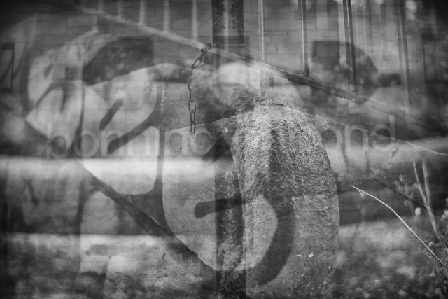
Our understanding of time is crystal clear but limited, we can see very clearly something of this concept and what it means to us but in reality, much is a mystery to us, out of our cognitive grasp.

Untitled


Cascade

One explanation of the concept of time could be; that phenomenon which stops all the events in the universe happening together, that is, all the ‘nows’ existing in the same spacetime. Our conscious selves experience this possibly as a series of frames. If you watch a movie ( a pre-digital movie anyway ) it is presented to you at 30 frames per second and to us, it feels like a natural flow of time. This image aims to present the idea of all the ‘nows’ at the same time by colliding together just a few nows. I used photoshop & layers to create a multiple exposures of 4 images. The images were taken within a few minutes of each other on a walk through a local park.
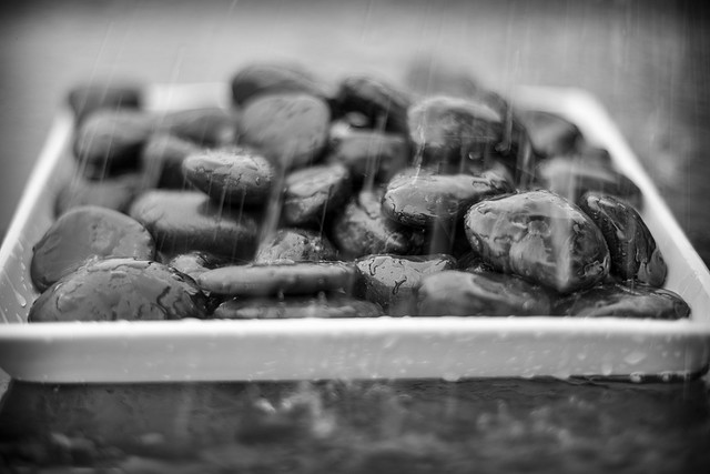
Untitled


Flow

Time flows as water does over a rock. The flow of time is perceived by us to be the most consistent and unerring of all phenomenon. Indeed like water flowing over rocks we expect to continue forever, unabated. We feel this but we feel it separately.

Untitled


Arrow

A classic western view. For many of us, we think of time passing as an arrow, moving incessantly forward. The laws of thermodynamics and of increasing entropy dictate this to be true. The arrow shoots and we can have only ‘now’ in full focus, clear and detailed, it is immediately in the past though and the clarity begins to fade to memory. The future we head towards, we can visualise even control in some ways, but at some point, it too stretches and bends it’s way out of our knowledge beyond what we can know.

Untitled


Circle

For all of history, time is perceived as circular and rhythmic; the daily cycle, lunar cycle, seasons and years, birth, death and rebirth. We are forever at some point in cyclic dances in time.
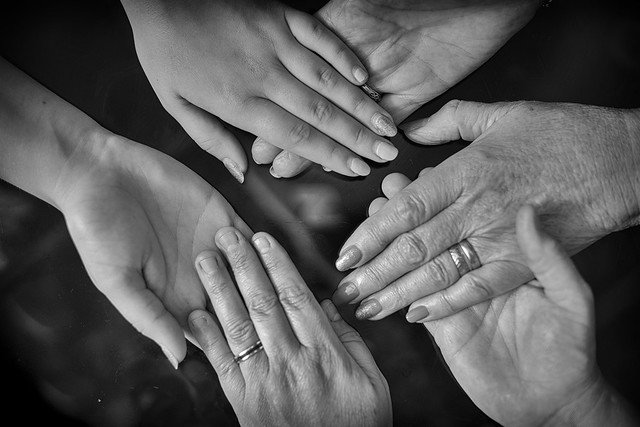
Untitled


Connected

Through all time, every woman has an actual physical connection from their mother to every generation before that has gone before. The umbilical cord is that physical connection. A female child is physically connected to their mother, immediately after birth and before the cord is cut. In this way, every female child has a physical connection to every female ancestor going back to the first mammalian. The physical connection is only broken by the introduction of time. Symbolised here as a connection across 3 generations; My mother, my wife and my daughter.
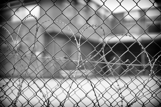
Untitled


Trap

For many of us, for far too much of our time, we feel trapped in and by time. The banality of our 9 to 5 existence, trapped and waiting for our weekend. The desperation of the 7-year-old child trapped and just needs to be older to be 8. We are slaves in our time, trapped!

Untitled


Loss

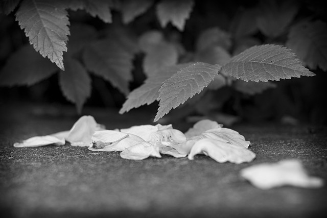
We know that with the passage of time, eventuality time will bring for to us loss. What was once strong and beautiful, in time fades and in the end is lost to us.

Untitled


Remember

We defy time and loss by remembering those we have loved and can no longer have in our time. This is how we fight our battle against the tyranny of time and the loss it brings.

Untitled


Moment

We truly win our battle with time when we transcend the tyranny when we step out of time and live only in the moment with those we love.

Untitled


Reflection

Demonstration of technical and visual skills

Materials, techniques, observational skills, visual awareness, design and compositional skills.

I believe compositional skills are most evident in this series in particular on; Arrow, Cycle, and Loss. I hope I am correct in thinking technical skill is evident in the use of focus and depth of field.

Quality of outcome

Content, application of knowledge, presentation of work in a coherent manner, discernment, conceptualisation of thoughts, communication of ideas.

I believe my ideas are conceptualised and communicated well within this series through the use of symbolism and allegory. Although I have felt the need to explain each shot with a brief introduction.

Demonstration of creativity

Imagination, experimentation, invention.

Some experimentation and invention are evident in cascade. Imagination is evident in the use of symbolism and allegory on most shots

Context

Reflection, research, critical thinking.

I was interested to find that after I had constructed the series I should research symbolism in photography to accompany the assignment. Discovery of equivalence fits well with the series. This research was a reaction to the series rather than leading the series.


References

Pultz, John. “Equivalence, Symbolism, and Minor White’s Way into the Language of Photography.” Record of the Art Museum, Princeton University, vol. 39, no. 1/2, 1980, pp. 28–39. JSTOR, http://www.jstor.org/stable/3774627.

encyclopedia Britannica. 2019. Minor White AMERICAN PHOTOGRAPHER. [ONLINE] Available at: https://www.britannica.com/biography/Minor-White. [Accessed 11 August 2019].

encyclopedia Britannica. 2019. Minor White AMERICAN PHOTOGRAPHER. [ONLINE] Available at: https://www.britannica.com/biography/Minor-White. [Accessed 11 August 2019].

Exercise 5.3: Looking at photography

The brief

‘When somebody sees something and experiences it – that’s when art happens’1

(Hans-Peter Feldman)

If photography is an event then looking at photography should also be an event.
Look again at Henri Cartier-Bresson’s photograph Behind the Gare Saint-Lazare in Part Three. (If you can get to the Victoria & Albert Museum in London you can see an original print
on permanent display in the Photography Gallery.) Is there a single element in the image that you could say is the pivotal ‘point’ to which the eye returns again and again? What information does this ‘point’ contain? Remember that a point is not a shape. It may be a place, or even a ‘discontinuity’ – a gap. The most important thing though is not to try to guess the ‘right answer’ but to make a creative response, to articulate your ‘personal voice’.

Include a short response to Behind the Gare Saint-Lazare in your learning log. You can be as imaginative as you like. In order to contextualise your discussion, you might want to include one or two of your own shots, and you may wish to refer to Rinko Kawauchi’s photograph mentioned above or the Theatres series by Hiroshi Sugimoto discussed in Part Three. Write about 300 words.


I will look again at :-

http://100photos.time.com/photos/henri-cartier-bresson-behind-gare-saint-lazare to meet the brief for this exercise.

Looking again at the photograph the area of the image I am continually drawn to is the space between the legs of the leaping man and his reflection ( or is it shadow ).

This area creates an almost perfect pentagon, broken only by the rails lying in the puddle. The rails break the pentagon at almost exactly the centre of the single vertical edge and almost horizontally. There is a very pleasing balance to this. Balance is the central theme of this image I feel and this pentagon is the centre of gravity for which this sense of balance permeates.

bresson

Balance is further enhanced by a line drawn following the railings which perfectly lies against the length of the main figure and their reflection.

The second most striking point about this image for me is energy and movement, for a still image there is a very strong sense of lateral movement. The energy is generated by the angle of the main subject in flight, the shape created between the legs and against the line of balance. The subject is running at pace rather than simply leaping over a puddle. All else appears still, static and fixed. There is for instance very little evidence of air movement as might be found by ripples in the puddle and I see evidence of mist or fog surrounding the buildings in the background again indicating a very still day. It may not be but the three formations through the fence in the background have a look of grave stones further emphasizing stillness and quiet, broken by the leaping man.

I notice a pleasing aesthetic produced by the random circular strips of metal just to the left of the leaping man again helps to complete and bring balance to the whole image.

To summarise; For me the most striking elements of this photograph are geometry, perfect balance and complex symmetry and juxtaposed explosive energy within a stillness. I could also sum this up by saying just about everytime I look at the shot I see something else of interest.


Exercise 5.2: Homage

The brief

Select an image by any photographer of your choice and take a photograph in response
to it. You can respond in any way you like to the whole image or to just a part of it, but you
must make explicit in your notes what it is that you’re responding to. Is it a stylistic device
such as John Davies’ high viewpoint, or Chris Steele Perkins’ juxtapositions? Is it an idea,
such as the decisive moment? Is it an approach, such as intention – creating a fully authored
image rather than discovering the world through the viewfinder?
Add the original photograph together with your response to your learning log. Which of the
three types of information discussed by Barrett provides the context in this case? Take your
time over writing your response because you’ll submit the relevant part of your learning log
as part of Assignment Five.
A photograph inspired by another is called ‘homage’ (pronounced the French or English
way). This is not the same as Picasso’s famous statement that ‘good artists borrow, great
artists steal’; the point of the homage must be apparent within the photograph. It’s also not
the same as ‘appropriation’ which re-contextualises its subject to create something new,
often in an ironic or humorous way. Instead, the homage should share some deep empathy
or kinship with the original work. An example is Victor Burgin’s series The Office at Night
(1986), based on Edward Hopper’s famous painting of the same name:
‘The hackneyed idea of ‘influence’ is not at issue here. I am not
interested in the question of what one artist may or may not
have taken from another. I am referring to the universally familiar
phenomenon of looking at one image and having another image
spontaneously come to mind.’
http://www.tate.org.uk/research/publications/tate-papers/separateness-things-victor-burgin
[accessed 25/01/18]
You may already have taken some homage photography where you’ve not tried to hide the
original inspiration but rather celebrated it. Refer back to your personal archive and add one
or two to your learning log together with a short caption to provide a context for the shot.


I took inspiration from Doug Aitken and his series of photographs – New Opposition. An example of this work is shown here :-

NewOpposition

In his series New Opposition, Doug Aitken explains that he was interested in fragmentation of an image, he wanted to form an image that was whole but also clearly constructed as fragments. In homage to this series I have adopted and concentrate on the ‘original context’ by creating my response using a very simalar construction technique and outcome. For my own purpose the concepts of fragmentation and whole were a perfect way to illustrate an idea I am currently interested in. Our perception of time can be thought of as a whole which we construct from fragments within past, present & future. These fragments we bring together to create our complete view of where we are, our place in time.  

One definition of time could be – that hard to understand concept that stops all the events of the universe all happening at once.

For my image here I have not taken any new shots, instead I have constructed a whole image made up of fragments from other photographs I have taken over the past couple of years. In that time I have been lucky enough to travel a fair amount and have pictures here from; Brooklyn skyline, Alaskan Glacier, Scottish Highlands & Stockholm archipelago. The image then is a representation my past as fragments all happening at once in a denial of time, so we see the whole.

4 images manipulated in photoshop to cerate a single image in homage to New Opposition

Part5-2-combined

During part 3 of EYV I was inspired by the decisive moment, the following shot is in my view the best example I achieved in direct homage to the idea of decisive moment. At the time it was my clear intent to capture what i understand to the decisive moment.

‘Homage to the decisive moment’

Untitled


Bibliography

Bright, S., 2005. Art Photography Now. 1st ed. London: Thames and Hudson.

Assignment 4 : Languages of light – reworked

The Brief

Revisit one of the exercises on daylight, artificial light or controlled light from Part Four (Ex 4.1, Ex 4.2 or Ex 4.3) and develop it into a formal assignment submission. The submission requirement for this assignment is a set of between six and ten high-quality photographic prints.There are many ways to edit and the most valuable one is probably to show your work to friends, family and your OCA peers for feedback – you are guaranteed to discover something new in your work. Another tip is to pin the work up on the wall and live with a for a few days. ‘A Quick Guide to Editing Your Photo Series using Stickies’ on the IPO (Invisible Photographer Asia) website, but bear in mind that this is not a narrative assignment – you’re not required to produce a story.
EDITING 101 – A Quick Guide to Editing Your Photo Series using Stickies

Assessment of photography in any context is an assessment of images and accompanying words so please Include a written analysis of your work outlining:

how you have developed the assignment from the original exercise in Part 4
which practitioners you’ve looked at for inspiration and how their work has influenced you
your technical approach and any particular techniques you incorporated
the strengths and weaknesses of particular photographs and your project as a whole (self-
assessment)

Conclude your notes with a personal reflection on how you’ve developed the exercise in order to meet the descriptors of the Creativity criteria. Write 500–1,000 words.


Background

Layered, complex and mysterious…

This is a reworking of assignment 4 after feedback from my tutor confirmed a suspected problem I had with the original submission and how it addressed the brief. In short the original submission was orthogonal to the brief at best. Shame, I really enjoyed creating the series, but in truth I was quite aware of the issue from the outset. Rather than identify a single element of light to concentrate on I attempted to investigate further on a wide spectrum of the complexity of light. In this reworking I focus in on artificial light and how this can be used to create atmospheric photographs.

Whilst going through the assignments and exercises in EYV I am learning many things about photography of course but also many things about myself. For instance I am finding out about my approach to the assignments; the inspirations and ideas for my assignments tend to come in an iterative and chaotic process of, part considered thought and part emergent ideas from the photographs I am taking. Considering my work during write up then is in part stratification and clarification of this cyclic process. There are in truth many thoughts and ideas I have during this process, some of which survive and galvanise into the rationale for the assignments, some die early and others linger in the background supporting the assignments but never having the strength to be promoted to inclusion in my write ups. For this re-work I have not taken any new shots. I have revisited the contact sheet and more importantly reconsidered the process I went through, the inspiration I used and the ideas i had along the way. Searching through this I could have chosen any of the aspects investigated in part 4 since all were fascinating to me ( hence my desire to stay broad and cover all aspects ) I have though chosen to concentrate on artificial light and how this can bring interest, drama and ambiguity to an image.

Four influences were strongest here –

Although not apparent in many of the photographs in this submission, the work of Brassai and his shots of Paris had a big influence throughout. In particular I picked up on Brassai’s use of light to help bring forth a narrative – see entry Brassai’s use of light to strengthen composition  from my learning log

Sato Shintaro work in neon street scenes in the blue hour I found very busy and exciting much like the city he photographs. I have been lucky enough to visit Tokyo and feel the energy from these images. This is in no small way powered by the copious neon light. This series has some similarities in that many of the shots are street scenes illuminated by artificial light, Helsinki however is much more relaxed and laid back than Tokyo and I hope this comes across in the series.
The work of Rut Blees’ night time images of London producing an ethereal gold wash across the city streets. The title of my series is Helsinki Gold but it was not the gold I took as inspiration it was the idea that a single colour can be pre-eminent. This was interesting to me during this series, that the colour happens to be gold was an emergent property of my investigations however.
Finally, inspiration from Lisa Barnard, The Canary and the hammer (Stein, 2019). This helped support the idea that a set of apparently disconnected images can come together successfully under a clear rationale.


Rationale

The series is a journey through the streets of Helsinki on a near midsummer midweek evening. It had actually been Finland day the day before which may explain to some extent the relative quiet of the scenes here as everyone was recovering from the previous days festivities but in truth the impression I got from the city was one of relaxation and simplicity – Helsinki is comfortable in it’s own skin. The journey begins just as the city is entering it’s blue hour and ends in darkness ( not so dark this far north in the middle of June ). As The light of the day recedes the influence of the street lights take on an ever increasing impact on the images created and the series at it’s heart aims to reflect this simple suggestion. I often feel there is an ambiguity in streets under artificial light. Everything seems more close more here and right now but at the same time there is an undercurrent of the world being not quite what it seems, ambiguous. Sometimes exciting and sometimes even dangerous but always more interesting. The impression of the shopfront (4) and the club window (7) during day time are tame and bland compared to these same scenes under dark and bathed in artificial illumination. The images of light on the street (1) and reflected lights on the building opposite (2) again suggest a world enhanced and more complex which is not apparent during the reality of daylight. Spaces (3) and faces (5) are also rendered with more intrigue and drama than their straightforward daylight equivalents. In the rooms of our evenings, light adds atmosphere and a touch of other world to our environments (6)

Technical

The series was shot entirely in manual mode which I am finding much more satisfying than my default which is to shoot in Aperture priority. I typically use histogram to select the correct exposure and find that this methods frees me up to select the correct exposure for the subject with ease.

As the light was fading and exposure time was increasing I increased ISO but only a little, i used a small tripod where necessary but a few shots of around 1/6s were taken handheld leaning against a post to aid stability.

Strengths and weaknesses

I think the series as a whole works as a response to the brief with focus on artificial light and and also as a representation of the ideas I had in mind whilst creating it. However none of the images I think are particularly strong or stand up particularly well on their own.

The strongest individual image in my view is (1) lights on street, strong lines and composition and a clear introduction to the series.

Image (3) Stockman is the image I would like to have been better than it turned out, focus is a bit soft ( handheld ), I don’t think this detracts from the image per-se but it is not what I intended for this. I also think it works better in a low contrast monochrome but that of course would not fit with the series. I did consider the series in monochrome, this can be seen in the sequencing shot, rejected as the clarity of single colour is lost.

Given time I would progress the series across all composition types in the series; street, shop/club fronts, people, reflected light, lights themselves. As the series expands across all elements the central theme of Helsinki in Gold would be strengthened. This could also be taken out of Helsinki, Edinburgh for me feels more silver than gold which is a project worth pursuing as a counterpoint to Helsinki Gold.

Creativity

I believe there is evidence of invention and creativity to bring together a coherent series of images under a single clear rationale (gold), from an apparently disconnected set. Imagination & invention also in some of the images, notably the lights super-imposed on reflection of building (2) and the slightly abstract lights on wall (6)


Presentation

Considering sequence and presentation for the series. This series would be best presented as a sequence of  individual framed images in perhaps a gallery setting. The sequence is chosen as a progression in throught the evening as the artificial light becomes more pronounced and gold becomes increasingly the subject of the the images.

For the process of sequencing I printed all shortlisted images and used a wall board to position the images until I had settled on my favoured sequence.

Untitled


Photoshop was used to create a vision of the art gallery setting with each image framed and hung in the intended sequence.

Untitled

Untitled


The series

Helsinki Gold

1

ƒ/5.0 47.0 mm SS1/20 ISO200

Untitled


2

ƒ/4.5 49.0 mm SS1/60 ISO200

Untitled


3

ƒ/9.0 70.0 mm SS1/6 ISO200

Untitled


4

ƒ/4.5 50.0 mm SS1/40 ISO400

Untitled


5

ƒ/5.6 70.0 mm SS1/10 ISO400

Untitled


6

ƒ/3.5 31.0 mm SS1/10 ISO400

Untitled


7

ƒ/4.5 50.0 mm SS1/5 ISO400

Untitled