Viewpoint

The Brief:

Select your longest focal length and compose a portrait shot fairly tightly within the frame in front of a background with depth. Take one photograph. Then walk towards your subject while zooming out to your shortest focal length. Take care to frame the subject in precisely the same way in the viewfinder and take a second shot. Compare the two images and make notes in your learning log.

The shots:


Shot1: f5.6, 140mm, SS 1/13s, ISO 320

Exercise 2.2 - Viewpoint 1

Shot2: f3.5, 18mm, SS 1/40s, ISO 320

Exercise 2.2 - Viewpoint 2

Notes:

In Shot1 the depth of field around the subject is much reduced in comparison to shot2, most notable in the bushes to the left of the subject. In shot1 the bushes appear immediately behind the subject whereas in shot2 they appear many yards in the distance.

With long focal length the background is flattened and with short focal length it is extended.

There is a change in aperture between shot1 (f5.6) and shot2 (f3.5) this is characteristics of the lens itself. In both cases aperture priority was set and aperture set to maximum. Even although aperture is smaller for shot1, the effect of long focal length and relatively open aperture results in the background being out of focus on shot 1. At this resolution the close position and wide angle of shot 2 results in fairly good focus through the image.


Zoom

The brief:

Find a scene that has depth. From a fixed position, take a sequence of five or six shots at different focal lengths without changing your viewpoint.

Taking inspiration from the examples above or from your own research, create a final image for your sequence. In EYV the important thing is to present your work in context, so make it clear in your notes what you’ve been looking at and reading. The focus here is on imagination and research skills rather than the technical aspects of zoom.

The series:

A series of 8 shots taken of a treelined pathway which I believe shows a sufficient amount of depth. All shots were taken from a single position using a tripod and with the same aperture (f8.0) and ISO100. Camera was set to aperture priority mode so some changes in shutter speed were noted as the camera selected SS for exposure.

f8.0, SS 1/10s, 18mm, ISO100

Exercise 2.1 - Zoom 1

f8.0, SS 1/8s, 24mm, ISO100

Exercise 2.1 - Zoom 2

f8.0, SS 1/6s, 38mm, ISO100

Exercise 2.1 - Zoom 3

f8.0, SS 1/6s, 52mm, ISO100

Exercise 2.1 - Zoom 4

f8.0, SS 1/5s, 75mm, ISO100

Exercise 2.1 - Zoom 5

f8.0, SS 1/8s, 95mm, ISO100

Exercise 2.1 - Zoom 6

f8.0, SS 1/8s, 116mm, ISO100

Untitled

f8.0, SS 1/8s, 140mm, ISO100

Exercise 2.1 - Zoom 8

The series shows the intent behind the technical aspect of this exercise with the feeling of “walking through the scene”. In an attempt to emphasise this aspect further I created an MP4 with all 8 images in the series.  This does help to visualise the effects of increasing focal length over the same subject.

zoom copy

Points noted:

At focal lengths below 35mm there is a notable wide angle effect where the centre of the image appears to be pulled further into the distance than is seen with the naked eye and the aspects on periphery of the scene appear pulled into the image.

The camera was set to multi-metering mode which in retrospect may not have been the best for this series. This mode attempts to meter for all areas within the scene, as the series progresses the increasing focal length removes some light from the top of the scene, this makes the images darker as the series progresses. Until the final image where the small amount of light in the centre becomes relatively larger in the scene.

Additional thoughts:

I was interested to see the effect on resolution in the scene at different focal lengths. This can be seen on the two cropped images below. Both are cropped down to a small section in the very centre of the image series around the puddle which emerges into view at around 50mm focal length. The first is a crop from the 75mm shot and the second from the 140mm shot. The cropped area is very small so both show pixelation however this is clearly more pronounced on the cropped 75mm shot reminiscent of a Thomas Ruff JPEG from earlier project work.

f8.0, SS 1/5s, 75mm, ISO100 – cropped

Exercise 2.1 - ZoomCrop 1

f8.0, SS 1/8s, 140mm, ISO100 – cropped

Exercise 2.1 - ZoomCrop 2

Final image

Typical for the genre a wide angle often provides powerful and interesting images which distort the image stretching the centre ground away into the distance and pul the edges in to the picture. The final image is taken from a few feet back from the series introducing the 3 bollards which help to emphasise the distorting effect of 18mm focal length.
Untitled

Inspiration:

In considering this series I investigated use of zoom in landscape photography using Bridgeman Education online gallery resource and created a slideshow here of images using wide angle.

https://www-bridgemaneducation-com.ucreative.idm.oclc.org/en/slideshow/3760

An example provided here.

Fig. 1 Kenny Muhammad – (June 2004) [Photograph] At: https://www-bridgemaneducation-com.ucreative.idm.oclc.org/en/asset/3890769/summary?context=%7B%22route%22%3A%22slideshow_view%22%2C%22routeParameters%22%3A%7B%22_format%22%3A%22html%22%2C%22_locale%22%3A%22en%22%2C%22slideshowId%22%3A%223760%22%7D%7D

3890769

Project 3 – Research personal thoughts

Personal thoughts

Ruff himself states a central purpose to this work at the beginning of this clip “Photography should reflect the medium”

Pixelation from such low resolution creates an aesthetic value, a beauty in it’s own right, disconnected from the original image. I see this most clearly as a tiling effect in certain parts of each of the images in the previous post. This is the final conclusion of complexity in Ruff’s JPEGs with each image seeming to have more than one identity; the image itself and the imagery created by the pixelation. This is expressed fully by David Campany in his many expressions of juxtaposition but is also realised by Jorg Colberg with his view of aesthetic value of pixelated and low resolution images.


Project 3 Research

Main points selected from reviews of Thomas Ruff’s JPEGs

David Campany

Complexity of RUFF’s JPEGs

Ruff’s JPEGs series are considered by David Campany as offering up a number of opposing concepts ie “Intellectual & aesthetic”, “public as is private”, “anonymous as it is personal”, “The effect is to simultaneously emphasize and de-emphasize due to Ruff’s serialisation”

The juxtapositions within the series culminates in a complex of rational and irrational tension caused by the low resolution pixelation as stated “These are all phenomena that cannot be mapped or modelled in their detail. They are in a sense irrational, anarchic. We see these subjects throughout Ruff’s  grids of pixels. We switch from looking at figuration to abstraction and back again. The result is a great tension or drama. And it is tempting to see in this drama something of the character of modern life with its great forces of rationality and irrationality.”

The archive has influence

Ruff’s images come from the Internet and the series lives on the internet in many archives. Campany’s considerations on the tension between order created through the archival process and entropy created through wild and chaotic nature of images never mind the shear number.

Photography should reflect the medium

“Ruff has done a great deal to introduce into photographic art what we might call an ‘art of the pixel’, allowing us to contemplate at an aesthetic and philosophical level the basic condition of the electronic image.”

Terribly poorly resolved but still visually aesthetical images my way. ‘Terribly beautiful’ images they were.” In a nutshell, this is the idea behind jpegs.

Printed medium works

Although taken from the internet, is in the form of digital data and designed to be presented on a screen, as stated by Jorg Colberg, “Ruff’s jpegs work amazingly well in book form”

Ruff’s JPEGs promise meaning but don’t deliver on depth

For Jorg Colberg Ruff’s JPEGs have an aesthetic value which is clear and strong enough to be justification in  it’s won right, however in searching for deeper meaning, which is apparently there to be seen he is unsuccessful or not convinced. “Images are beautiful but cant see what else there is with the concept of the JPegs which is thin”

I compare 2 photographs which i have taken myself over the past year or so with two of Ruff’s collection which I downloaded from the Internet. I selected my shots as I found them compositionally similar to Ruff’s. I found the process of reducing resolution to create a Ruff like pixelated version simple.

Untitled

Alaska glacier

Untitled

ml_HAgallery_ThomasRuff_09_1024 (Custom)


Project 2 – “Visual Skills” – Exercise 1.4 – Frame

The brief

Exercise 1.4 Frame

The final exercise of this project makes use of the viewfinder grid display of a digital camera. This function projects a grid onto the viewfinder screen to help align vertical and horizontal lines, such as the horizon or the edge of a building, with the edge of the frame. Please check your camera manual (or Google search) for how to display the grid in your viewfinder. If your camera doesn’t have a grid display, just imagine a simple division of the viewfinder into four sections.

Take a good number of shots, composing each shot within a single section of the viewfinder grid. Don’t bother about the rest of the frame! Use any combination of grid section, subject and viewpoint you choose.

When you review the shots evaluate the whole frame not just the part you’ve composed. Looking at a frame calmly and without hurry may eventually reveal a visual coalescence, a ‘gestalt’.

Gestalt: an organised whole perceived as more than a sum of its parts. (Google Search using the define: operator)


Investigations

I am intrigued by this exercise, mostly as i have recently been reacquainted with the term “Gestalt”. I have been spending some time lately listening to a number of audio books covering various topics; science, history, philosophy. Gestalt has come up in both science and philosophy as an explanation of sorts for some form of activity within our mind helping to create our perception of reality. Coffee! what does that make me think of; a bean, a steaming cup, starbucks, one of those cofficianados. It is of course all of these things.

I toyed with the idea of creating the sequence around simply the idea of coffee. However I decided there was more scope and interest for this exercise in the area around where I work. The sequence was created from shots taken on a waterside walk i enjoy often at lunchtime around the area of Leith in Edinburgh.

Technical details

Sony II with 28..70mm lens

I set the grid view which splits the frame into 9 segments on the viewfinder and used the spot focus function to set the focus area in each of the 9 segments as I strolled around the area taking shots of anything i found of interest, paying all attention on the segment in focus and ignoring completely the rest of the frame. To emphasise this set aperture wide open ( 4.5 or 5 ) to take focus away from the rest of the frame. I used aperture priority so the camera was doing the rest of the work to set exposure. In post processing i used auto balance and vivid presets only and employed only very little crop and alignment. I then imported the chosen shots into photoshop and created the combination. I used the position of focus in each shot to dictate that shots position in a 3 X 3 grid eg shot with focus on top right is placed top right in the grid.

Assessment

After taking a number of shots all were loaded into Lightroom and i selected the 9 I thought were of most interest and complimented one another. I rejected a number of shots which themselves are perhaps more interesting and pleasing on the eye because they worked against the whole, for instance in my first selected 9 I found once i had organised them that too many shots had leading lines created by path and river. This introduced a confusion in the purpose of the series – was it about a walk along a river or about lines created by nature? In a second attempt at the series there appeared too many man made signs so again I re-thought and selected others. My plan was to deliver a Gestalt of ‘A lunchtime walk along a river’ so wanted to include the many different elements you might find along the way; fauna, river, buildings, walkways, signs and the like. In this way I hoped to create an holistic image for the observer. I am pleased with the outcome. Not one of these shots would I consider individually to be of much merit however collectively I really like the clarity of purpose and images they evoke which I interpret as a Gestalt. The “term greater than the sum of the parts” springs to mind here.

A lunchtime walk for lucky people.

Untitled

Assignment 1: Square Mile

First impressions

Two ideas come to mind; 1) The area i grew up in shot from the height of a 6 year old, dropped as i would also like it to summer when I take these shots so may revisit. 2) Edinburgh city centre, it is where i have worked and played for the last 30 odd years, so a loose angle on work and play might work. Edinburgh is also gearing up for Christmas celebrations so lots of scope for interesting pictures.

Inspiration

Gawain Bernard https://www.gawainbarnard.com/photo_13162026.html

Boredom to burn: The landscape of youth is laden with memories

Lines up well with my first idea of childhood square mile

Thoughts on Gawain, ‘sit’ the series of young people with pensive expressions coupled with images of trees and bushes ( can’t see a direct connection ) but provides a consistency of imagery.

From Jodie Taylor – https://weareoca.com/subject/photography/photography-and-nostalgia/

This really resonates with me, Jodie’s series here comes from the same place as my first idea. In my mind though for my square mile, I am 6 I think here Jodie is more like 16.

Tom Hunter

http://www.purdyhicks.com/display.php?aID=10#16

Inspirational idea connecting environment now to some mythical elements. Edinburgh has many examples where the past mythical, dangerous, gothic, horrific lives side by side with the world today, an interesting theme which could build a series

Technical Approach

My approach on this was to strip things down to bare essentials. Most shots are taken either with a 50mm lense or with focal length around 50mm. Also most shots are taken with aperture around F8.0. My main aim here was to provide a ‘as you see it’ documentary style to the pictures. All pictures have been loaded into lightroom with an import preset ( standard presets of auto + vivid ), whist only a few have had some cropping in lightroom.

Kit: Sony a7 II 28..70mm kit lense, Nikor 50mm, tripod for some longer exposure night shots

Self assessment

I have achieved to some degree I think a series with some level of fit, for instance the pairing of shot of the crane and the swings. This aspect of the project is what i found most challenging since i have not really done this before. I spent most of the time trying to work out what would make two shots ‘fit’ in a series. Technically i think the shots i have chosen are fair at best. I really like the shot of the swings through the Scott monument, which to me says something about gravity and frivolity in the same space, duality is common of course in many places and definitely of Edinburgh. All shots with people in are completely opportunistic, i am uncomfortable with taking shots of people candidly so these are technically poorer I think as I struggle to settle on the shot in the time available and i don’t think i have really captured anyone particularly well here. To take this forward I would like to create a stronger theme of work & play in the context of the city, some of the shots talk of this but more could be done here.

The Series

Series_2

Series_3 Series_4

Series_5 Series_6

Series_7 Series_8

Series_9 Series_10

Project 2 – “Visual Skills” – Exercise 1.3 – Line

The brief

Take a number of shots using lines to create a sense of depth. Shooting with a wide- angle lens (zooming out) strengthens a diagonal line by giving it more length within the frame. The effect is dramatically accentuated if you choose a viewpoint close to the line.

Now take a number of shots using lines to flatten the pictorial space. To avoid the effects of perspective, the sensor/film plane should be parallel to the subject and you may like to try a high viewpoint (i.e. looking down). Modern architecture offers strong lines and dynamic diagonals, and zooming in can help to create simpler, more abstract compositions.

Review your shots from both parts of Exercise 1.3. How do the different lines relate to the frame? There’s an important difference from the point exercises: a line can leave the frame. For perpendicular lines this doesn’t seem to disrupt the composition too much, but for perspective lines the eye travels quickly along the diagonal and straight out of the picture. It feels uncomfortable because the eye seems to have no way back into the picture except the point that it started from. So another ‘rule’ of photography is that ‘leading lines’ should lead somewhere within the frame.

Investigation

The rule, as stated in this exercise, ‘leading lines should lead to somewhere in the frame’ is clear from the first 2 shots here. The first shot has the lines ending more or less on the intersection of top left third, on the horizon. The second is feels clipped with the leading lines leaving the frame on the left.

Why should this rule be the way it is? My theory on this …

The leading lines below accentuate the 3 dimensionality of the scene and take the observer on a journey into the frame. For us, our journeys need to have a destination so without some end point for the line the observer can’t see the journeys end, has no closure and is left frustrated. We live our lives with horizons and all lines tend towards those horizons, we typically either see the horizon or it is blocked from our view by some structure ( building, hill, trees etc ). Our lines then typically end at the horizon or at the blocking structure. To have the line end by exiting the frame therefore feels unnatural and constrained.

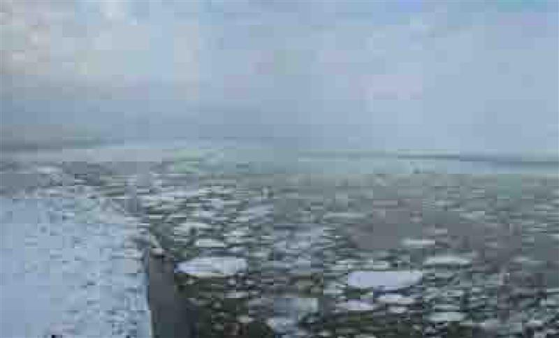
Wide angle 18mm focal length extending the leading lines, ending on the horizon. A strong image which leads the observer on the journey to the end of the road.

Untitled


Leading lines leave the frame directly and the observer is left to wonder what this image is trying to portray. Is the fence itself the point?

Untitled


The next two shots provide another example of the same concept of journey into the frame following the lines ( this time curved ). Observers eye is drawn into the frame, resting where the line disappears into the woods. There is a strong sense again of 3 dimensions in the frame and of a journey to be taken by the observer.


Untitled

Here in contrast with the path clipped, most of the sense of 3 dimensions and journey is lost and the observer must search for the subject, which now becomes the plant pot in the top centre third.

Untitled


To contrast this the next shots have strong lines but are intentionally flat with no sense of 3 dimensions at all in the frame. I used the high view point looking directly down (as referred to in the brief from László Moholy-Nagy ) to a carpet here .The lines serve no purpose other than to exist as an image for their own sake. There is no journey so no frustration with the lines not ending in the frame. This for me delivers a strong sense of purpose but without a narrative, the purpose is pure and aesthetic. To experiment with this theme the next 3 shots show lines in the frame in different directions, each has the same effect and impact.

Untitled Untitled

Untitled

Testing the theory of journey and horizon, the next two shots repeat the theme of leading lines which end in the frame and exit the frame. However this time there is no horizon per se as the lines lead straight into the sky. Again though the sense of completeness and closure where the lines end within the frame, present a far stronger intent to the observer. In the second image where the lines exit the frame, the observer is more likely to consider the centre of the frame and the tendency is to see these lines as pure and aesthetic and not a narrative or a journey to be had.

Untitled

Untitled


Although the image has infinite 3rd dimension into the frame, the angle flattens all lines and the image is pure and aesthetic. In this case the image here is reminiscent of https://www.theartstory.org/artist-moholy-nagy-laszlo-artworks.htm#pnt_6  László Moholy-Nagy first abstract painting in shape at least.

Untitled


Summarising above

Leading lines take the observer into the frame and deliver a strong sense of 3 dimensions, of journey and narrative. This can help create a clear intent and purpose for the image. If however the lines have this intent but exit the frame, the narrative and purpose can quickly be lost and the observer is left to work out the purpose for themselves. Conversely where the image has a strong linear content where there is no 3rd dimension or journey accentuated, then those lines can become strong and pure with an aesthetic value in their own right, outside of any narrative.

References

https://www.theartstory.org – László Moholy-Nagy

Project 2 – “Visual Skills” – Exercise 1.2 – Point

After a very useful chat with my tutor I am now better prepared for addressing this exercise. I at first, was confounded in how to approach this.

In considering a spot and it’s place in the frame I look at the picture in the course notes for the exercise; the cup under chair. This leads me to think that there is a narrative at play here which adds a dimension to the composition. Someone has sat on that chair and drunk from that cup, lazily leaving it lying there, it makes sense, so the position of the cup in the frame makes sense and it works regardless of any rule of third’s etc. My idea was to take a football in a field placed at various points in the frame around a set of goals. I can see the narrative in just about every position, which has nothing to do with where the ball is in the frame but more where the ball is in relation to the goals. As an example, every watcher of football knows what a ball slightly right of centre and 20 yards out from goal means – A good chance of imminent excitement. Having talked this through with my tutor I have decided to try to try at least at first to avoid a narrative dimension by creating pictures that are more abstract.

My spot is a Christmas decoration.

Here my eye is drawn to the bauble and immediately to the back of the frame and round to the left observing the empty space.

Untitled

Centre of frame. Subject is obvious and the image is balanced but lacks any intent or imperative for the eye to go anywhere other than the subject which then appears small and insignificant.

Untitled

There is some intent here, suggesting a journey to or from the top right by the bauble. My eye tends to bounce between the bauble bottom left and top right.

Untitled

Open space at the bottom of the frame seems wasteful, my eye is drawn over only once and I then discount the space.

Untitled

Again in this image there is a sense of journey had or to be taken by the bauble, my eye is drawn between the bauble and top right where the draft excluder creates some haven or end / beginning.

Untitled

Bauble as subject is less obvious but a sense of movement to be is evident. In this case though the movement follows the line straight up the centre of the frame.

Untitled

Journeys end. This image, although there is much empty space, still has an internal balance to me and the large amount of empty space does not seem pointless. My eye follows an imagined journey from bottom left in an anti-clockwise arc towards it’s destination top right.

Untitled

Here both the bauble as subject and sense of journey are less clear and the empty space in the centre of the frame remains empty and wasteful.

Untitled

Bringing in some sense of narrative with a decorated Christmas tree using up the top 3rd of the frame. My eye is immediately drawn to the bauble and then round clockwise through the frame, helped by the shape of the tree and light on right hand side.

Untitled

Bauble as subject is all but lost here. Eventually my eye rests on the bauble after observing the frame for a while. Once there though there is an interesting subtlety that allows me to rest here and contemplate the baubles journey.

Untitled

In this case centre bottom 3rd intersection, the sense of journey feels clipped, limited to a direct fall from the tree, however I like the centrality and sense of symmetry this provides. It makes for a strong message that this is about “a bauble that has fallen off this tree” and thats it clear and concise.

Untitled

Project 1 : The Instrument

For this project i have taken 18 shots, 9 outdoors and hand held and 9 indoors and using tripod. For each series of 9 I have taken a sub series of 3 shots with the same settings and varied aperture and ISO across the 3 series in the 9.

The objective of this project is really to notice the histogram and how this changes in perhaps subtle ways even when the image is the same ( or so the photographer may think ).

I can seen across series of pictures that the histogram is different in all cases.

Of course there is a clear difference between the two series of 9 shots given the different composition and lighting.

My approach to this was to see for myself if different apertures or ISO levels had any noticeable effect on differences in histogram across the shots. On this series it is inconclusive, which probably means no. However i think there is a difference between series 10 .. 12 and 13 .. 15 which may be attributed to the change in aperture from f4.5 to f8.0, all else remains unchanged.

Loaded all shots into lightroom and took a screenshot along with the histogram


The series

Aperture Priority
ISO100 f4.5

1

Untitled

2

Untitled

3

Untitled


ISO200 f4.5

4

Untitled

5

Untitled

6

Untitled


ISO200 f8.0

7

Untitled

8

Untitled

9

Untitled

ISO200 f4.5

10

Untitled

11

Untitled

12

Untitled

ISO200 f8.0

13

Untitled

14

Untitled

15

Untitled

ISO1250 f8.0

16

Untitled

17

Untitled

18

Untitled


Square Mile : Technical Approach

I think I am about half way through this assignment in terms of photographs to take ( at about 150 ).

My approach has been to try to remove all temptation to introduce interest in these photographs through the extremes of my equipments capability, by that i mean; avoid extreme’s of aperture, shutter speed and focal length. I want the photo’s i take here to be as you would see it.

Why? It is the start of this journey so I think I want to strip myself bare and start from scratch.

I am using

  • Sony a7 II as i will i think for the foreseeable future and perhaps all of this course.
  • 50mm prime lens ( Nikon ) with a convertor which supports auto-focus. All shots so far have been using this set up, I am going to shift to native Sony kit lens 28..70mm for the rest of my shooting but make sure i have a focal length around 50mm. Just think i will get better results.
  • Vast majority of shots are taken with in aperture priority mode I have become very used to shooting in this mode and have stuck to this for the challenge. Doesn’t really fit the strip bare idea but i don’t know what to replace it with. I will break out of this soon enough no doubt.